Primark
Project Date: 2022
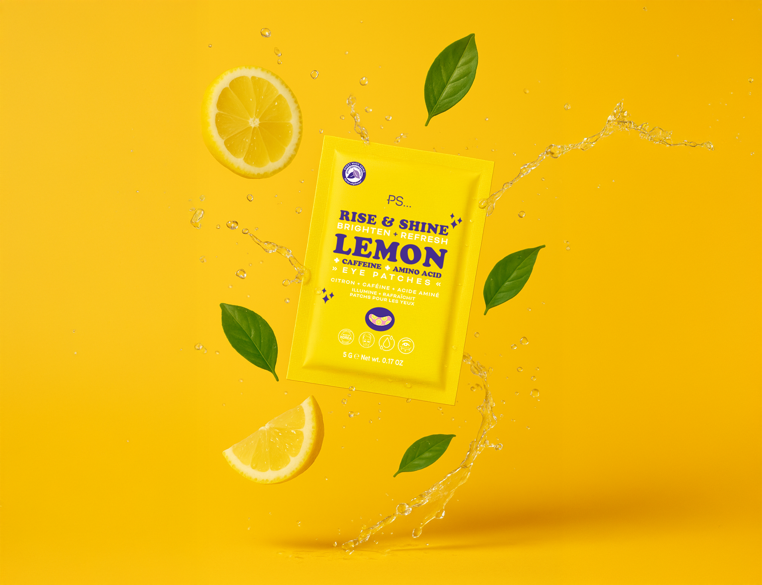
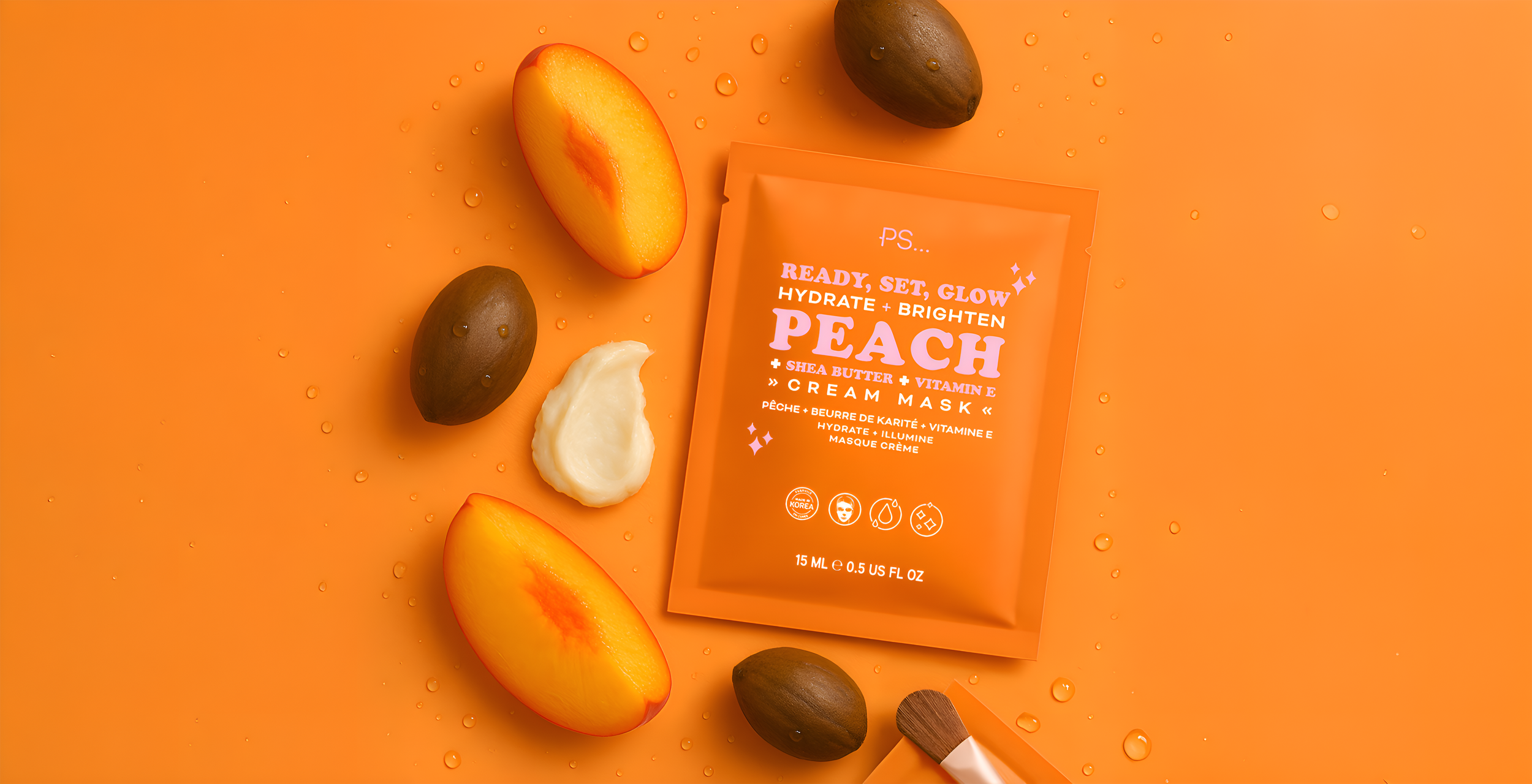
A visual adaptation project for a private label beauty line. This project involved translating an existing visual direction into custom packaging design for a skincare concept pitch. Inspired by Primark’s youthful, trend-forward aesthetic, I explored how color, typography, and product messaging could be fine-tuned to match target ingredients and enhance shelf impact.
My role included layout refinement, conceptual alignment with brand and product goals, and preparing press-ready label files for production.
Scope: Visual adaptation, layout exploration, press-ready prep, brand matching
Contributions:
Ingredient-brand alignment
Label hierarchy + typography
Color + messaging rationale
Press-ready file prep
Tools Used: Illustrator, Photoshop, Acrobat


Project Impact:
Translated a trend-forward visual direction into polished, production-ready packaging for a multi-product skincare concept
Managed extensive client feedback with agility, building trust through thoughtful, high-quality revisions
Elevated product appeal by refining layout, color, and messaging to align with key ingredients and brand tone
Opened the door to ongoing partnership by successfully delivering the client’s first multi-product design collaboration

